March 30, 2012

Blog II: Research Statement and Annotated Bibliography

I would like to conduct research in the field of the neoclassical design movement specifically with reference to the symbolism found in neoclassical architecture and design.

The following are possible sources appropriate for this research.

1. Book

Parissien, S. (2000). Palladian Style. London: Phaidon

This book explores the origins of Palladian style during the 18th Century through to Palladian revival in the 19th and 20 Centuries. This book focuses on architectural details and motifs found in Palladian structures. Palladian style is derivative of the the classical Greco-Roman architecture and is thus relevant to my research.

2. Scholarly Journal Article

Levine, J. M. (2002). Why Neoclassicism? Politics and Culture in Eighteenth-Century England. Journal for Eighteenth-Century Studies, 25 (1), 75–101. doi: 10.1111/j.1754-0208.2002.tb00245.x

This journal article is very useful and relative to my research topic as it outlines why designers, architects, artists and the general public were so interested in this style. It discusses the 18th century reasoning behind the rise of neoclassicism with reference to Greco-Roman history and the symbolism these rich cultures offered at the time.

3. Edited Book

Millon, H. A. and Nochlin, L. (Eds.). (1978). Art and architecture in the service of politics. Cambridge: MIT Press

The contents of this book range from political architecture from the Constantinian times through to modern times in the 20th Century. This book is suitable for this research topic as it shows the links between neoclassical architecture and its political significance it held within the neoclassical movement.

4. Website

National Gallery of Art. (2012). 18th and 19th Century France - Neoclassicism [Webpage]. Retrieved from http://www.nga.gov/collection/gallery/gg56/gg56-over1.html

This webpage belongs to the National Gallery of Art of the United States of America and this specific webpage outlines the precursor of the neoclassic movement. It suggests the symbolic relationship between the French Revolution and neoclassicism and would be useful in the research topic that I have chosen.

5. Image

Voronikhin, A. N., Scheibe, C., Naschon, I., Focht, C. and Schaschin, S. (1803)
New York: The Metropolitan Museum of Art. (2000). Settee [Image], Heilbrunn Timeline of Art History. Retrieved from http://www.metmuseum.org/toah/works-of-art/2007.368

This image is a very appropriate source for this research topic as it is a photo of a settee made in 1803 in the neoclassical style. It was made for the bedroom of Czar Alexander I of Russia and clearly has an aura of elegance and stateliness typically associated with the neoclassical movement.

Section: Process

Argh, bad quality image
Played around with scale, did cross-cuts and rip-cuts, happy with the final piece :)


March 29, 2012

Touch and Draw

Teapot drawn with a teapot using tea. TEACEPTION.

Individual Work


 I chose to draw my mechanical pencil from Section into a 3-point perspective form. I was inspired by a photograph of the Rockefeller Center in New York and how the photographer used this specific angle to depict this architectural great. 

the Rockefeller Center

Although this precedent image is not a technical drawing, I felt that it was appropriate for this task as this example illustrates the structural magnificence of the Rockefeller Center.  This style is mainly used for buildings, but I decided to draw my pencil in this style as it monumentalizes this piece of stationery into something it is not. 

At first glance, this drawing looks like a high-rise building and the scaling and angle enhance this effect. I chose not to render, hatch or shade my pencil as I wanted to have clean, neat lines that showcase the linear nature of the pencil itself.

Section

Section

 Not as much going on as some of the other works during studio sessions, but I think simple and clean really speaks to me.

Draw

Draw
I kept this image "raw" to showcase the freehanded-ness of the drawing. The detailed section looks crispier than expected though.

Hatch

Hatch
I was actually worried about Hatch because I thought it would be the most mundane task but it turned out really nicely once I sat down and started penning it in.

I was inspired by the different textures in fabrics and textiles I saw around the Studio.


Identity

The first task. Also the one that I think defines us the most. Selecting five objects from my bag was difficult because I knew instinctively that everybody had cellphones, earbuds and stationery.

As I began drawing, however, I found that it was the process that set everybody apart.

Identity
from left: earphones, clutch pencil, pencil leads, piano key, Very Valentino EDT


Hatch: Process

This is what my sketchpad looks like on most pages...

There it is! My brainwave

Draft

Identity: Process

Precedent


I based the composition of my piece around the lines I identified in the mountainscape in the painting. Unfortunately, I have no idea who's work that is...

To really see the relationship between the lines in the precedent image and my piece, you have to tilt your head a little and do some zooming into the precedent - trust me, the relationship is there.

101: COPY/TRANSFORM

Just some general info before we get into this clustercuss, I've tagged this project under:

101/p1_Identity

and so on and so forth because I didn't think to write down the tags the tutors wanted... my bad.
Also I blogged my design processes with some of the pieces - but theyre tagged with process.

Here we go.

March 19, 2012

Blog I: Design Persona

Every day, every moment, design makes me think. This thought somehow lead to my conclusion that I get inspired by anything and everything. Even if something is considered to be "bad design" I believe that the experience is priceless.

My ultimate goal, or aspiration, in the design field is to become a tastemaker. A trendsetter. Like Jason always says, I want to train my eye. I want to be the very best, like no one ever was. I want to see beyond the visible and use this ability to create and lead within the design world.

I would like to create designs that make people think. Like Lego. The Lego Group was founded by Ole Kirk Christiansen in 1932 and is now one of the most successful toy manufacturers in the world. Lego brings people together but also allows your imagination to run fantastically wild. Over time, it has evolved dramatically into the building blocks of many childhoods.

I know you all remember this guy. No real than you are.

Not only is Lego culturally significant, a large deal of thought has been put into a modern day Lego piece. Each piece must fit perfectly with others, while serving a unique function in the model itself. Lego is a big part of my life as a 90's kid and even though I have stepped on millions of stray bricks, no amount of foot pain will take away the impact it has had on my understanding of physics, imagination and the "big picture".

I could go on forever with Lego jokes, srs.


So here's what I think my answer to your questions is. Why am I at design school? The more I think about it, it comes down to the fact that I genuinely want to be here - to learn, to train and to evolve.

Oh, and here's me:
My face. Do you recognize me?
I'm pretty sure this was due at midnight before Tuesday, not Monday so fingers crossed... haha...

March 18, 2012

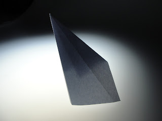
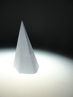
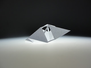
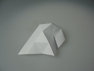
Information Aesthetics: Part II

Some basic light table photos from the second task in DSDN 111.
I think I might go with repetition (of geometric shapes) or asymmetry... maybe hierarchy? Decisions, decisions.

The Spire
1.1 

1.2 
 The Negative
2.1

2.2
 The Shelter
3.1

3.2
 Reptilian
4
 The.. UFO?
5.1

5.2
Coming up with 5 different concept designs were harder than I expected but I think experimenting with more iterations, combining multiple structures or even combining the different concepts would look pretty sick. Imagine a electronica cathedral made of the Spires with elements of the Negative. With the gospel choir singing dubstep. Aaawwww Yeeeaaaah fist bump.

Amy Poehler likes my ideas.


March 13, 2012

Information Aesthetics: Part I

Make a 3D "thing" out of paper, they said.
Only straight lines and folds, they said.
No glue or tape, they said.

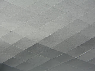
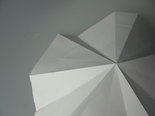
We were given images like ones seen here to be inspired by - but at this stage I feel that the word "inspire" has passed its use-by date having been used at least three times per lecture or studio.

At first I began with folding the paper randomly ("inspired" by the dynamics of the image which involved a lot of random peaks and lines), then in favor of contrast I folded the paper as evenly as i could, creating a triangular tessellation all across the piece of paper - order vs disorder. This allowed me to shape and fold the paper into 3D(ish) shapes. These won't be uploaded right now because they're pretty much scrunched up bits of paper.

So where did I go next?

Paper is funny in that it seems to be one of the greatest of great inventions of man, yet about four folds and creases later, it turns to mush. Messy, unmanageable and plagued with split ends. Like my hair. So this is when I decided to score the paper lightly to get these folds, without having to manhandle the "thing".

Result:
The different angles creating different depths.

a closeup

Heavy Rain?

Split - Shoddy Craftsmaship ft. Low Qual. Could make some epic scale models of terrains using this technique.

Still not happy though. Too messy. Too planar. Must investigate further.

March 9, 2012

Soundbite


So we watched Helvetica and... well it was a learning exercise. Having seen it before it wasn't anything super new to my mindgrapes but I think its good everyone got to watch it since it showed a whole different field of design (typeface design) and it made a point out of universality but also timelessness - not to mention the little offshoot explanation about grunge typography and post-modernity.


Please excuse the iPhone photo quality, shitty 30 second Photoshop skills and handwriting. I was in no rush but I'm a lazy git. And I was hungry.

Also testing the labelling and tabs today. I'm pretty sure I got this blogging thing down.

Its now 11:11am. Time to make a wish.

Update.
No I do not have this down. I have to set up a link list widget when I get back from 171 tutorial. Ugh.

March 7, 2012

mic check onetwo onetwo

So... Design school, eh?

Let's get all blogged up and test this baby out!

..is this working?